BIKE HELMET ADS
INDIVIDUAL ProJECT | 3rd-YEAR visual Communications
fall 2021
Objective
Choose an existing product and design three ads, using one image and text only, to reflect the following different demographics:
6–10 year-olds
20–30 year-olds
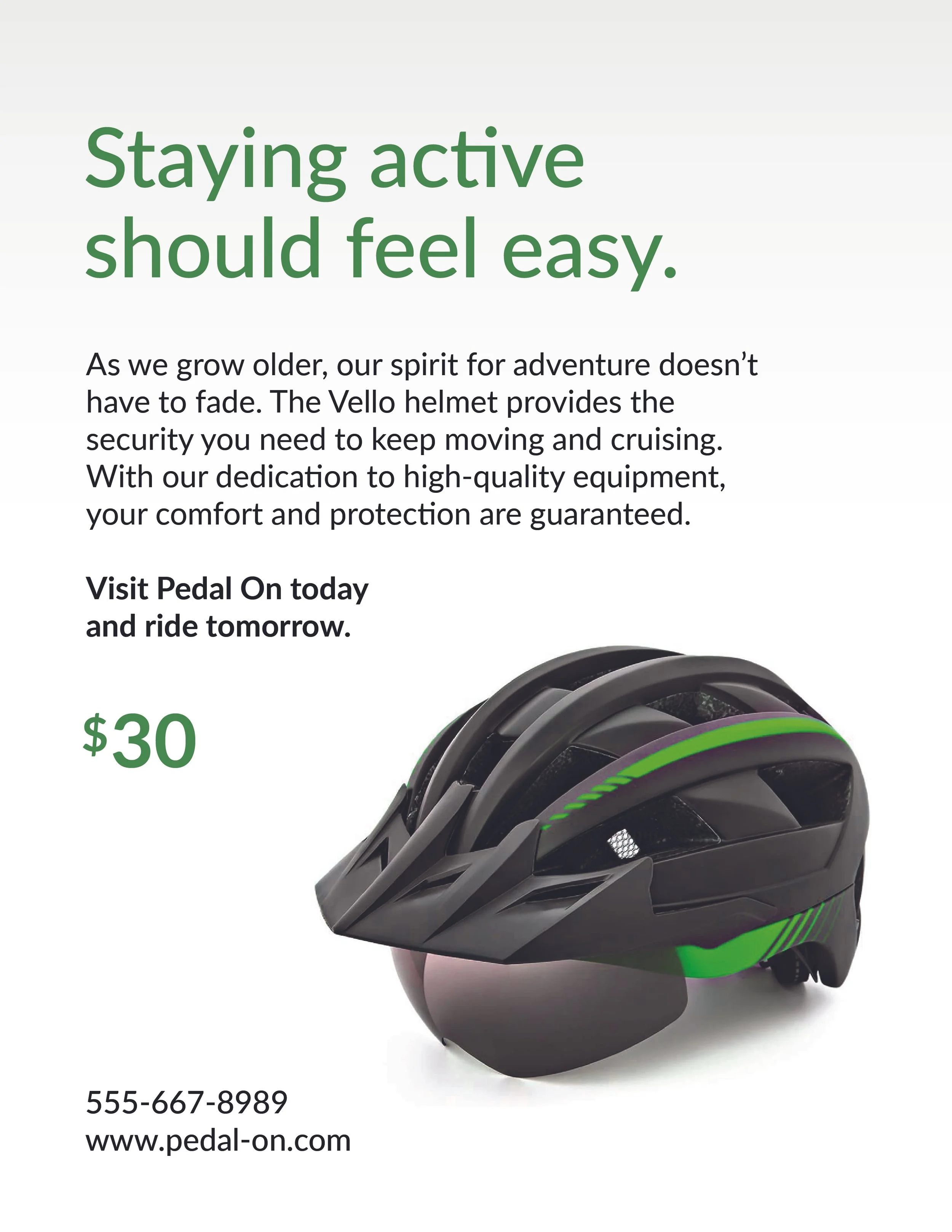
70–80 year-olds
Outcome
I created three ads for bicycle helmets. I challenged myself to chose images without people to explore how to market the products to specific populations without them being visually represented.
Advertisement #1: 6-10 year-olds
I used the Quicksand font for the headings due to its round and friendly nature. It is sans-serif, composed of basic geometric shapes, and has a tall x-height, making the letters easily recognizable for kids beginning to read. I chose Mulish for the description due to similar qualities, but its sharper characteristics make it slightly more serious and appealing to the parents. I left-aligned all the copy since this is what kids are used to as they learn to read.

Advertisement #2: 20-30 year-olds
I used various weights of the Work Sans typeface in this ad. This age range tends to be more receptive to design trends, so I selected a modern, sans-serif font that is easily readable and suitable for a product that is bold yet elegant. Because the given age range typically has higher visual acuity and reading ability, I was able to incorporate a title in all-caps to create contrast against the rest of the content, while reducing contrast between the colours used throughout the ad. I also varied the alignments between right and left to vary the flow of the page.

Advertisement #3: 70-80 year-olds
I chose Lato for the font, a humanist typeface known for legibility. Some of its characteristics are loose spacing and wide counters. As people grow older, they tend to lose some of their ability to read small and complex type. By using weight variations of Lato in large font sizes, I aimed to increase readability. I also made the hierarchy of the page easy to follow top to bottom. The shade of green I have chosen has been identified to be accessible against white. It additionally hints at the theme of vitality. The majority of the ad is black and white to provide maximum contrast. The generous white space alleviates fatigue by providing a break between blocks of text.